Fala galera, estou tentando o layout da imagem e estou com bastante dificuldades.
Segue os códigos:
HTML:
<section id="about" class="about-area">
<div class="container">
<div class="row">
<div class="col-lg-12">
<div class="text-container">
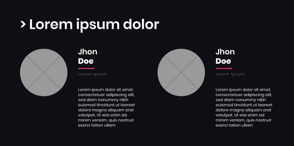
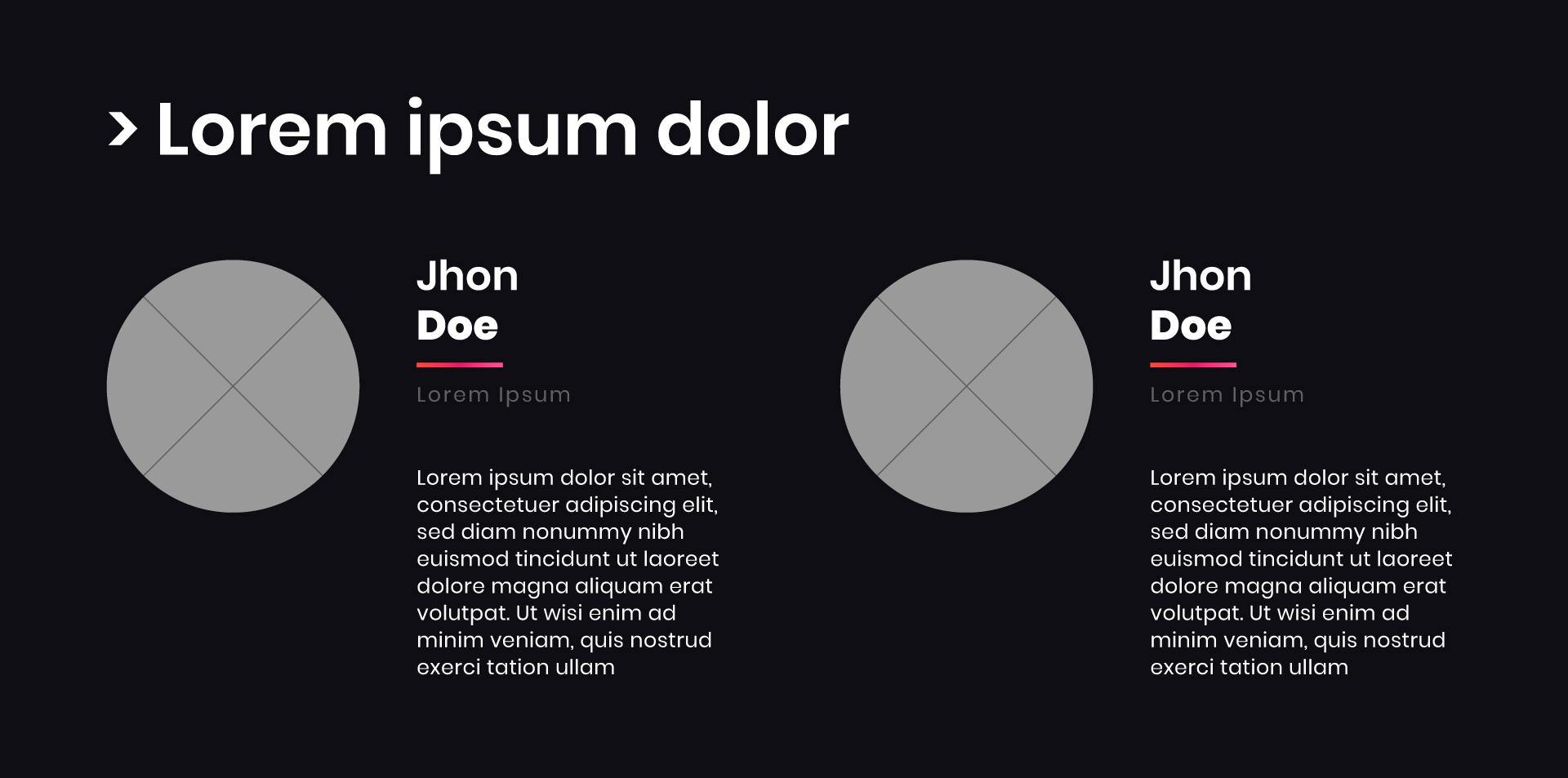
<h1>Lorem ipsum dolor </h1>
</div> <!-- end of text-container -->
</div> <!-- end of col -->
</div> <!-- end of row -->
<div class="row">
<div class="col-lg-12">
<!-- Team Member -->
<div class="team-member">
<div class="image-wrapper">
<img class="img-fluid" src="assets/images/team-member-2.svg" alt="alternative">
</div> <!-- end of image-wrapper -->
<p class="p-large"><strong>Lacy Whitelong</strong></p>
<p class="job-title">Business Developer</p>
<span class="social-icons">
<span class="fa-stack">
<a href="#your-link">
<i class="fas fa-circle fa-stack-2x facebook"></i>
<i class="fab fa-facebook-f fa-stack-1x"></i>
</a>
</span>
<span class="fa-stack">
<a href="#your-link">
<i class="fas fa-circle fa-stack-2x twitter"></i>
<i class="fab fa-twitter fa-stack-1x"></i>
</a>
</span>
</span> <!-- end of social-icons -->
</div> <!-- end of team-member -->
<!-- end of team member -->
<!-- Team Member -->
<div class="team-member">
<div class="image-wrapper">
<img class="img-fluid" src="assets/images/team-member-2.svg" alt="alternative">
</div> <!-- end of image wrapper -->
<p class="p-large"><strong>Chris Brown</strong></p>
<p class="job-title">Online Marketer</p>
<span class="social-icons">
<span class="fa-stack">
<a href="#your-link">
<i class="fas fa-circle fa-stack-2x facebook"></i>
<i class="fab fa-facebook-f fa-stack-1x"></i>
</a>
</span>
<span class="fa-stack">
<a href="#your-link">
<i class="fas fa-circle fa-stack-2x twitter"></i>
<i class="fab fa-twitter fa-stack-1x"></i>
</a>
</span>
</span> <!-- end of social-icons -->
</div> <!-- end of team-member -->
<!-- end of team member -->
</div> <!-- end of col -->
</div> <!-- end of row -->
</div> <!-- end of container -->
</div> <!-- container -->
</section>
CSS:
/*===========================
4.ABOUT css
===========================*/
.about-area {
position: relative;
background-color: #17171B;
padding-top: 100px;
padding-bottom: 100px; }
.about-area .section-title .title {
font-size: 44px;
font-weight: 600;
line-height: 55px;
color: #121212; }
@media (max-width: 767px) {
.about-area .section-title .title {
font-size: 22px;
line-height: 32px; } }
@media only screen and (min-width: 576px) and (max-width: 767px) {
.about-area .section-title .title {
font-size: 28px;
line-height: 38px; } }
.about-area .section-title .text {
font-size: 20px;
line-height: 25px;
color: #121212;
margin-top: 8px; }
@media (max-width: 767px) {
.about-area .section-title .text {
font-size: 16px; } }
.single-about .about-icon img {
width: 120px; }
@media (max-width: 767px) {
.single-about .about-icon img {
width: 100px; } }
.single-about .about-content {
padding-left: 30px; }
@media (max-width: 767px) {
.single-about .about-content {
padding-left: 0;
padding-top: 30px; } }
@media only screen and (min-width: 576px) and (max-width: 767px) {
.single-about .about-content {
padding-left: 30px;
padding-top: 0; } }
.single-about .about-content .about-title {
font-size: 20px;
font-weight: 600;
line-height: 25px;
color: #ffffff; }
.single-about .about-content .text {
font-size: 16px;
color: #ffffff;
margin-top: 16px; }
/*===== ABOUT 2 =====*/
.about-area-2 {
position: relative;
padding-top: 120px;
padding-bottom: 120px; }
.about-area-2 .about-image {
position: absolute;
width: 40%;
height: 100%;
top: 0;
right: 0; }
@media only screen and (min-width: 992px) and (max-width: 1199px) {
.about-area-2 .about-image {
width: 34%; } }
@media only screen and (min-width: 768px) and (max-width: 991px) {
.about-area-2 .about-image {
position: relative;
width: 720px;
margin: 0 auto; } }
@media (max-width: 767px) {
.about-area-2 .about-image {
position: relative;
width: 100%;
padding-left: 15px;
padding-right: 16px;
margin: 0 auto; } }
@media only screen and (min-width: 576px) and (max-width: 767px) {
.about-area-2 .about-image {
position: relative;
width: 540px;
margin: 0 auto; } }
.about-area-2 .about-image .image {
max-width: 580px;
width: 100%; }
@media only screen and (min-width: 768px) and (max-width: 991px) {
.about-area-2 .about-image .image {
margin: 0 auto;
padding-top: 50px; } }
@media (max-width: 767px) {
.about-area-2 .about-image .image {
margin: 0 auto;
padding-top: 50px; } }
.about-area-2 .about-image .image img {
width: 100%; }
.about-content-2 {
position: relative;
z-index: 9; }
.about-content-2 .about-icon i {
font-size: 64px;
color: #ffffff; }
.about-content-2 .about-content {
padding-left: 15px; }
@media (max-width: 767px) {
.about-content-2 .about-content {
padding-left: 0;
padding-top: 15px; } }
@media only screen and (min-width: 576px) and (max-width: 767px) {
.about-content-2 .about-content {
padding-left: 15px;
padding-top: 0; } }
.about-content-2 .about-content .about-title {
font-size: 24px;
font-weight: 500;
line-height: 30px;
color: #ffffff; }
.about-content-2 .about-content .text {
font-size: 14px;
line-height: 20px;
color: #ffffff;
margin-top: 8px; }
/*===== ABOUT 3 =====*/
.about-area-3 {
background-color: #17171B;
padding-top: 50px;
padding-bottom: 100px; }
.about-area-3 .image {
width: 100%; }
.about-area-3 .about-content .sub-title {
color: #ffffff;
font-size: 24px;
line-height: 30px;
font-weight: 700;
text-transform: uppercase; }
@media only screen and (min-width: 992px) and (max-width: 1199px) {
.about-area-3 .about-content .sub-title {
font-size: 20px; } }
@media (max-width: 767px) {
.about-area-3 .about-content .sub-title {
font-size: 20px; } }
.about-area-3 .about-content .about-title {
font-size: 44px;
font-weight: 500;
line-height: 55px;
color: #ffffff;
margin-top: 16px; }
@media only screen and (min-width: 992px) and (max-width: 1199px) {
.about-area-3 .about-content .about-title {
font-size: 38px;
line-height: 45px; } }
@media (max-width: 767px) {
.about-area-3 .about-content .about-title {
font-size: 32px;
line-height: 35px; } }
.about-area-3 .about-content .text {
color: #ffffff;
font-size: 20px;
font-weight: 500;
margin-top: 16px;
line-height: 25px; }
@media only screen and (min-width: 992px) and (max-width: 1199px) {
.about-area-3 .about-content .text {
font-size: 18px; } }
@media (max-width: 767px) {
.about-area-3 .about-content .text {
font-size: 16px;
line-height: 24px; } }
.about-area-3.about-area-bg-3 {
background-color: #fff; }
/* About */
.team-member {
display: inline-block;
width: 12.5rem;
margin-right: 2rem;
margin-left: 2rem;
vertical-align: top;
}
/* end of about */
/* About */
.team-member {
margin-right: 2.25rem;
margin-left: 2.25rem;
}
/* end of about */
/*********************/
/* 14. About */
/*********************/
.basic-4 {
padding-top: 7rem;
padding-bottom: 4rem;
text-align: center;
}
.basic-4 h2 {
margin-bottom: 1rem;
text-align: center;
}
.team-member {
max-width: 12.5rem;
margin-right: auto;
margin-bottom: 3.5rem;
margin-left: auto;
}
/* Hover Animation */
.image-wrapper {
overflow: hidden;
margin-bottom: 1.5rem;
border-radius: 50%;
}
.image-wrapper img {
margin: 0;
transition: all 0.3s;
}
.image-wrapper:hover img {
-moz-transform: scale(1.15);
-webkit-transform: scale(1.15);
transform: scale(1.15);
}
/* end of hover animation */
.team-member .p-large {
margin-bottom: 0.25rem;
font-size: 1.125rem;
}
.team-member .job-title {
margin-bottom: 0.375rem;
}
.fa-stack {
color: #ffffff;
margin-top: 0.375rem;
margin-right: 0.125rem;
margin-left: 0.125rem;
font-size: 1.25rem;
}
.fa-stack-2x {
color: #ffffff;
transition: all 0.2s ease;
}
.fa-stack-1x {
color: #fff;
transition: all 0.2s ease;
}
.fa-stack:hover .fa-stack-2x {
color: #ffffff;
}
.fa-stack:hover .fa-stack-1x {
color: #fff;
}